
What They Don't Teach You About Chart Patterns

First off, let me just put a disclaimer that the observations regarding chart patterns here are mainly based on foreign currencies because I trade them on a daily basis.
I'm not done testing this in equities yet since I don't trade there regularly. I'm more of a position trader in our local stocks rather than a day trader.
Compared to forex and cryptocurrencies though, it seems that there are less issues in using chart patterns in the stock market in general because it's the least manipulated among the three. However, it has its own nuances which I might write a separate post about in the future, we'll see.
I've only used daily charts in my examples below, just for the sake of uniformity. But chart patterns can be used in all other time frames as well.

A. Continuation
Continuation chart patterns are used to time a better entry during a "pause" in a strong trend, aka pullback or retracement. There are 2 common types of continuation pattern: flags and pennants.
1. Flags
1.1 Bullish Flag
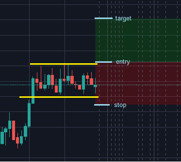
EURAUD Mar 2018
1.2 Bearish Flag
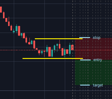
AUDUSD Oct 2014
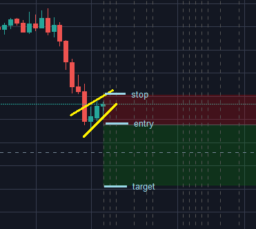
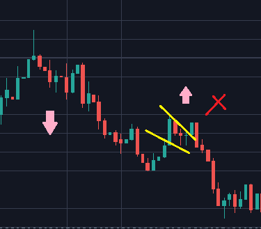
1.3 Confusing Flag
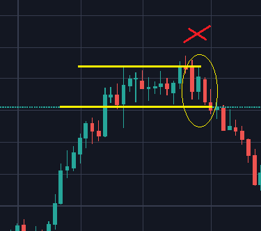
CADJPY Jul 2017
Here the flag failed because if we look closely inside the horizontal bars or "flag", we'll see doji candlesticks instead of the regular ones ranging inside. Dojis are neutral and signal that the market is uncertain where to go next. More often, after a really strong trend (i.e 5th wave in Elliot), the probability of dojis signalling a trend reversal gets higher.
2. Pennants
2.1 Bullish Pennant
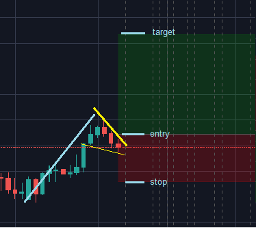
AUDJPY Jun 2017
2.2 Bearish Pennant
CADJPY Dec 2015
2.3 Confusing Pennant
AUDUSD Oct 2017
II. Reversal
Reversal chart patterns are used to gauge if the current trend is about to end soon, and time an entry well for the new trend. The most common reversal patterns are double tops (bottoms), head and shoulders, and wedges.
1. Doubles
1.1 Double Top
EURAUD May 2018
1.2 Double Bottom
GBPAUD Aug 2018
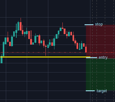
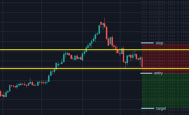
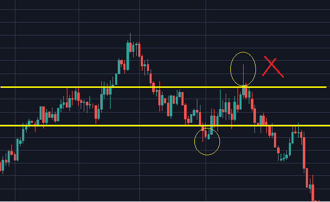
1.3 Confusing Double
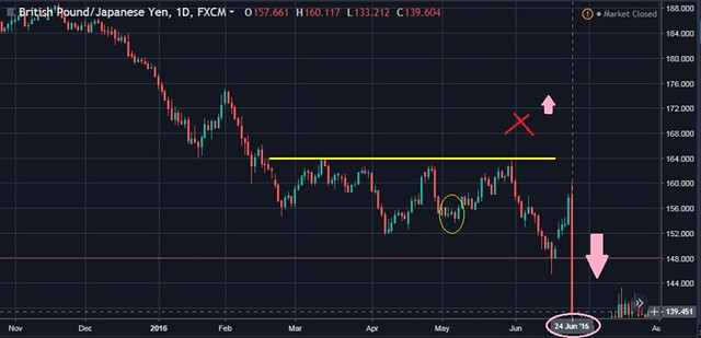
GBPJPY Jun 2016

Despite the higher low signal in this double bottom which normally reinforces a bullish trend soon, for this pair it failed because if we try to remember what happened during this period, June 23rd was Brexit Day.

Most players in the market (especially the whales) wanted to act cautiously and waited for the news release of Leave vs. Remain voting result before, well... panicking as the bloody candlestick above suggests afterwards.

Sherlock, nooooooooooooooo!!
2. Head and Shoulders
2.1 Usual Head and Shoulders
USDCAD Feb 2016
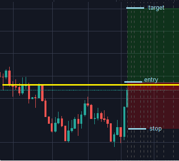
2.2 Confusing Head and Shoulders
NZDUSD Sep 2017
Unlike the examples of confusing chart patterns above where price went opposite of what's commonly expected, here the price did go to where it's supposed to go. But it printed a shooting star first which would definitely hit most traders' stop loss since it's often advised to put the SL right on top of the "shoulders" and the middle part of the "head". NZD's Global Daily Trade index, which measures the change in the average price of dairy products sold at auction, was higher (0.3%) than previous period (-0.4%), hence the short-term bullish bias for this pair. You'd be lucky if you avoided entering any position 2 weeks before the news despite seeing this head and shoulder, and traded afterwards instead.

3. Wedges
3.1 Rising Wedge
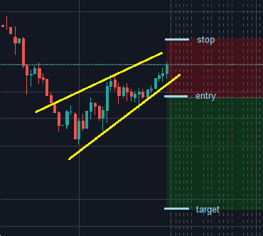
EURJPY Apr 2016
3.2 Falling Wedge
CADJPY Aug 2014
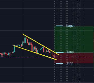
3.3 Confusing Wedge
GBPCAD Nov 2016
Unlike pennants which form in a very short time period, wedges drag on longer with their ranges getting narrower over time. Like pennants, price breakout occurs on the opposite direction of the narrowing range. However, the big hammer candlestick on the left (with plenty of space as well on the left), signals a high chance of the price reversing. So it's something also worth considering before setting up stop orders. I often wait for the breakout (and sometimes bounce) as confirmation before entering any orders.
Better safe than sorry.
III. Continuation and Reversal
The known chart pattern which falls in this category is the cup and handle. Cup and handle can be used both in trending and ranging markets (dual purpose), and signals a high probability breakout above the "handle".
1. Cup and Handle
XAGUSD Apr 2016
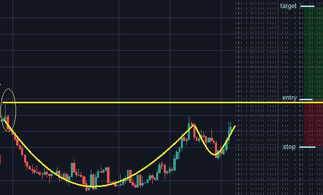
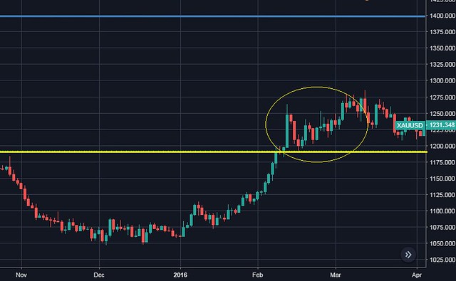
2. Confusing Cup and Handle
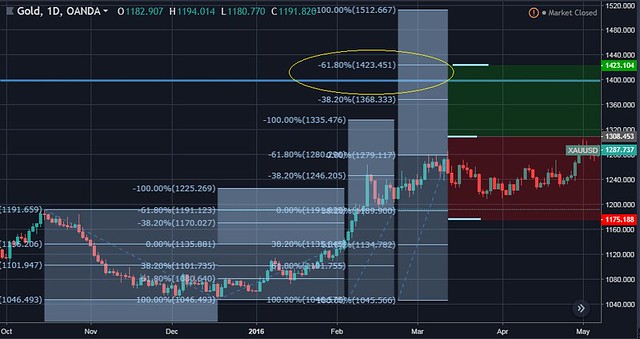
XAUUSD Mar 2016
IV. Continuation or Reversal
The well-known pattern under this category is the triangle. Regardless if it's ascending, descending or symmetrical, it doesn't hint which direction price will go next unlike the patterns above. Price can go either way (bilateral). I don't really know it's purpose other than giving me a sign to do something else and avoid trading for the meantime. Triangle shouldn't be confused with pennants.
Unlike pennants where the edges of the "flag" both go up or down together (and generally occurs in a very short time to simply signal a pullback), one of edges in triangles go in a perfect straight horizontal line-- except for symmetrical triangle where both edges equally converge in the middle of the triangle range, and shows no directional bias like the pennants. Sometimes other signals such higher time frame trend, and certain candlestick formation such as shooting star or hammer can help gauge where price will go next-- but not all the time.
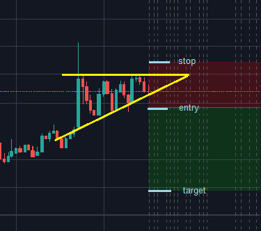
1. Triangle
EURAUD Oct 2015
2. Confusing Triangle
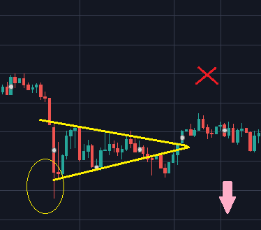
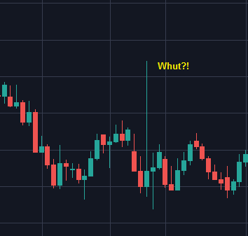
CADJPY Sep 2015
Despite the hammer candlestick here possibly hinting a reversal and a bullish trend soon, this pair eventually said "Nope, just a fakeout".
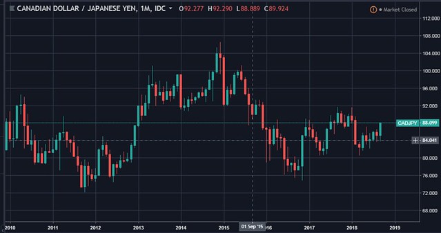 If we look at the monthly chart, overall trend was bearish this time. It even went more bearish after Gov. Poloz' speech who hinted continued dovishness by BOC that year (they had 2 rate cuts back in 2015).

Summary
To sum it up, here are the usual reasons why chart patterns don't often work in the foreign currency market.

It's usually best to not rely on chart patterns alone. Instead, get a deeper understanding of the price action involved and the market psychology behind the movements. At the same time, retail traders should also be alert about other traps to avoid getting whipsawed by the Big Boys.

It's usually best to not rely on chart patterns alone. Instead, get a deeper understanding of the price action involved and the market psychology behind the movements. At the same time, retail traders should also be alert about other traps to avoid getting whipsawed by the Big Boys.
Feature photo by Stephan H. of Unsplash.
0 comments:
Post a Comment